

First Baptist Church of Red Bank
Shining a Light on Red Bank Church with a Rebrand
First Baptist Church of Red Bank
Shining a Light on Red Bank Church with a Rebrand
FBC Red Bank will always hold a special place in my heart. It was the church where I was raised, baptized, and married. I was thrilled to have the opportunity to shine a light on what a fantastic church they are to the Red Bank community. Like in most churches, they lacked a branding system and marketing was pieced together in between the gaps by willing staff and volunteers. With the hope of better representing the quality of their ministry, appealing to young families, and being true to their heritage, I was brought in to evaluate their branding and marketing.
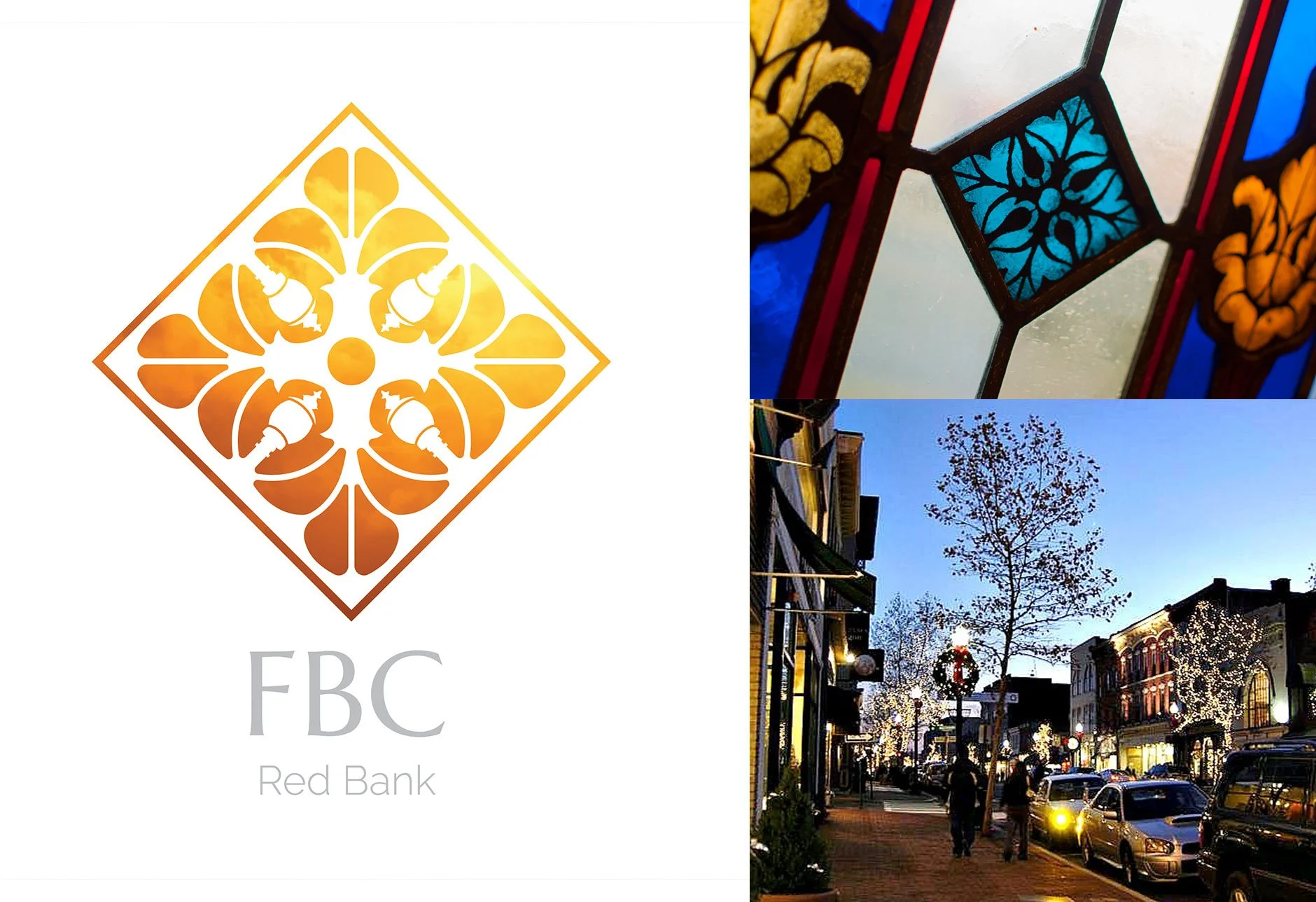
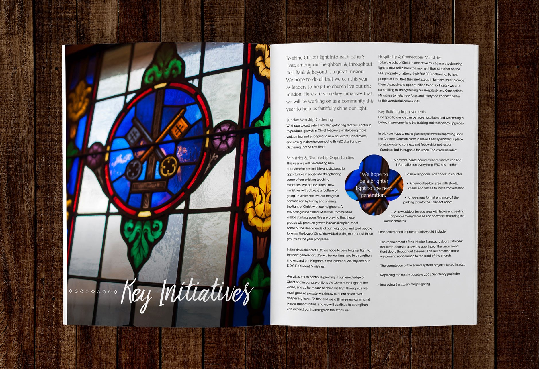
First Baptist Church's history dates back to 1844. Their current structure was built in 1893. The building has a uniquely high church feel for a Baptist church. They have beautiful stained glass windows that they purposely light from the inside every night that they might be a light that shines out into Red Bank. I was struck by how this concept of being a light captured the timeless essence of the church. If God is the light, then the church is the window through which his love shines.
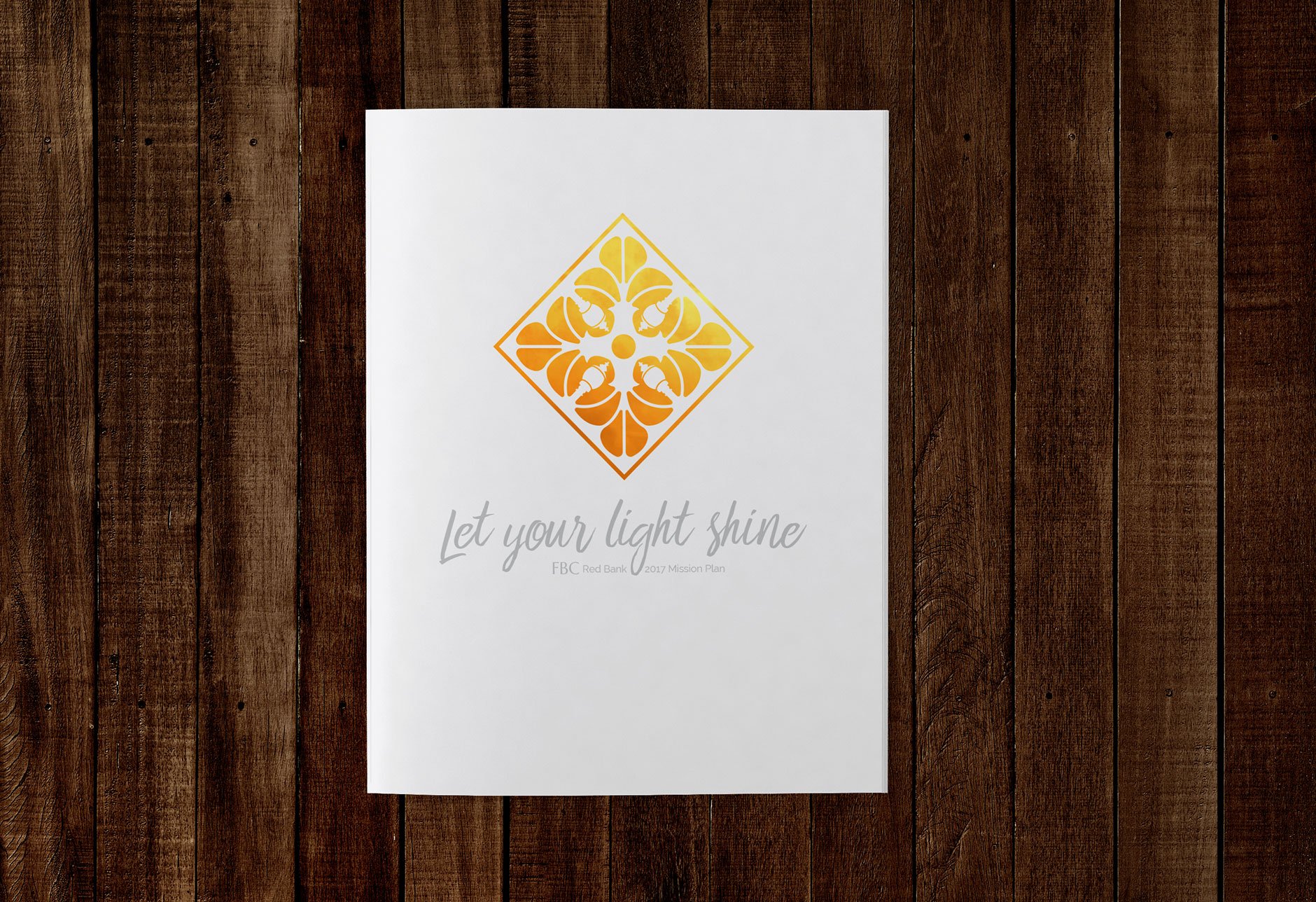
Each of these windows has various beautifully crafted symbols. I stumbled across this one variation of the quatrefoil that was repeated in several windows. At first it seemed like just a simple adornment, but I felt this emblem could be the beginnings of a vehicle to capture the history and mission of the church. The quatrefoil is an old Christian symbol representing the four Gospels. Inside, there was a subtle cross that seemed to reach out and spread like leaves or petals, the way the church seeks to spread its message of hope to all people. I wanted to tie it all back to Red Bank, which is where I saw the opportunity to subtly integrate the iconic street lamps of Red Bank into the negative space of the icon and point those lamps towards the cross.
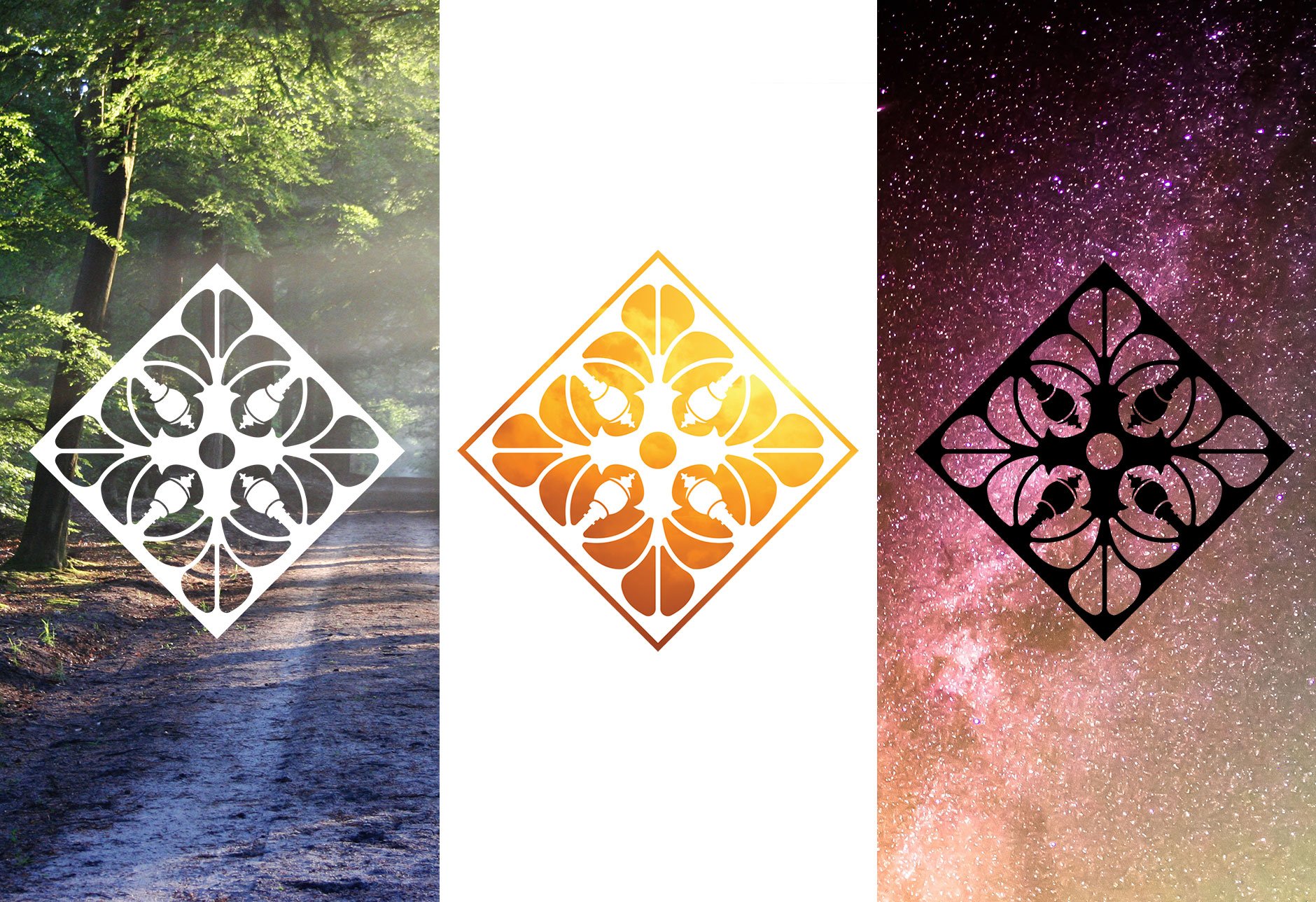
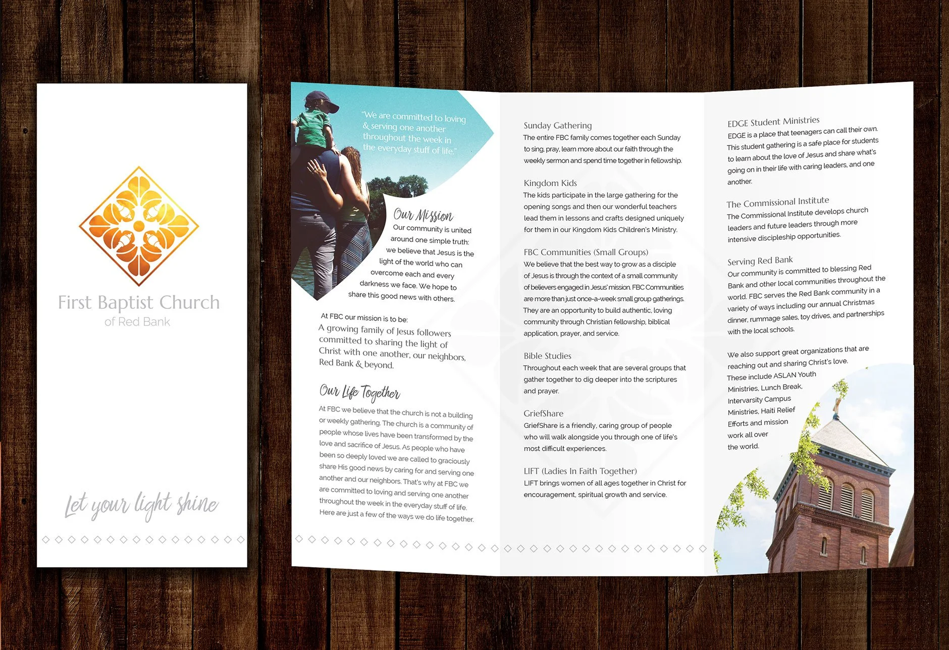
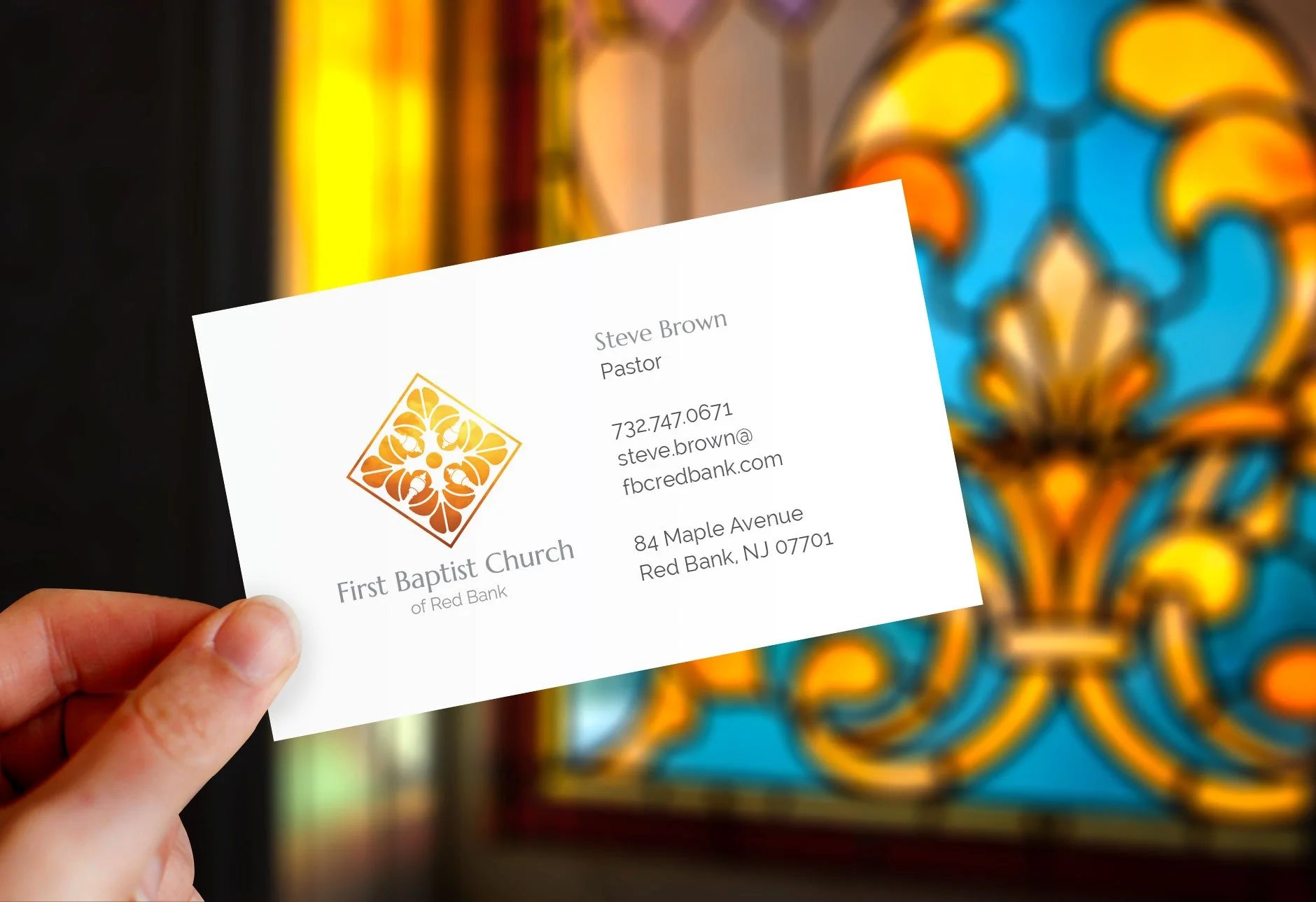
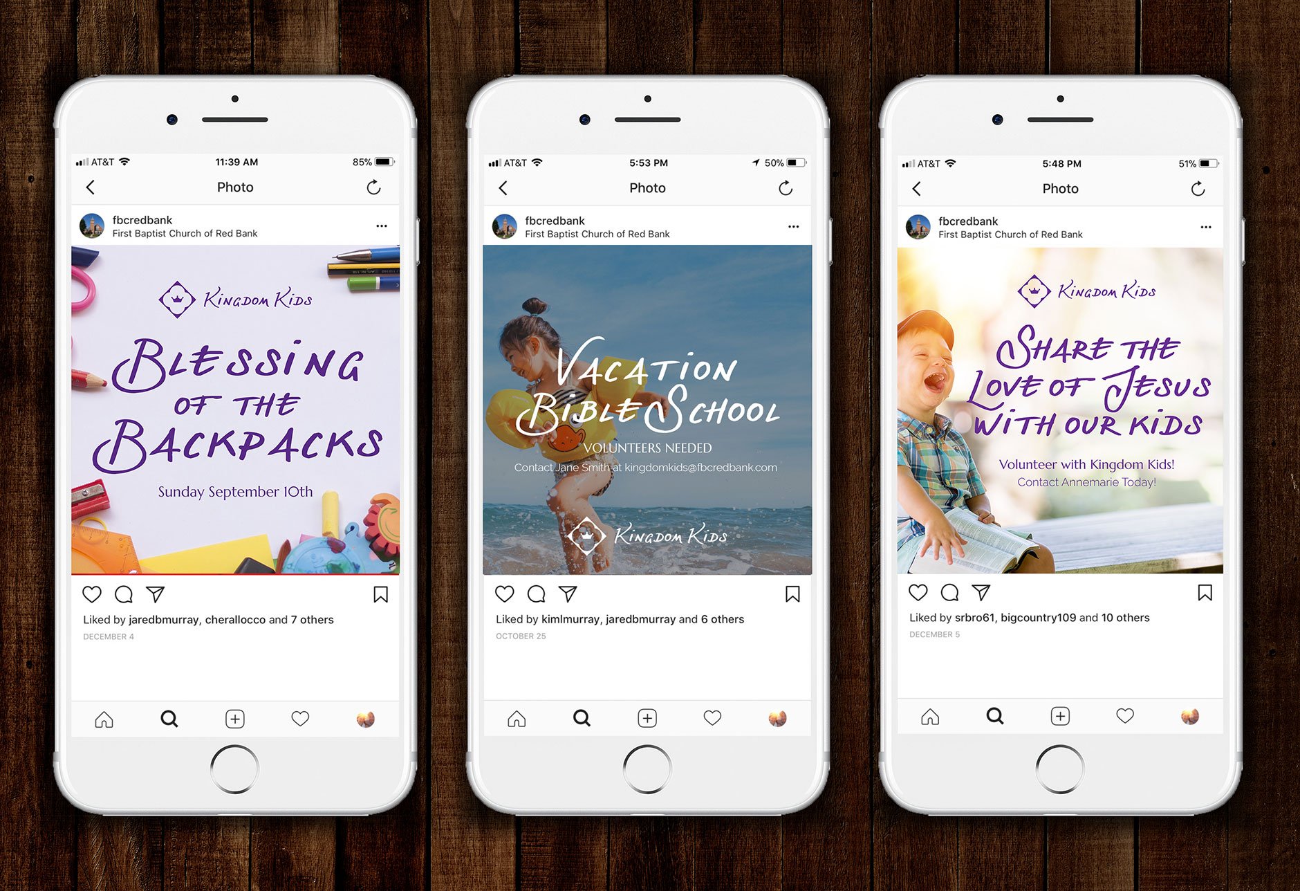
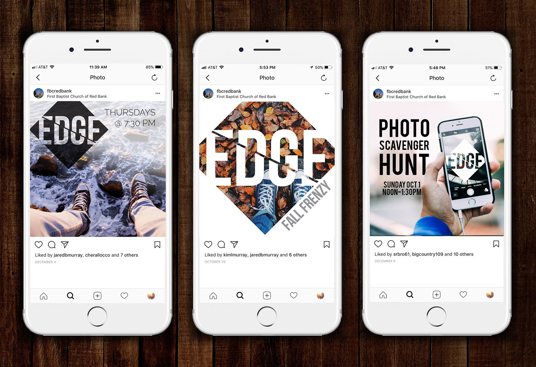
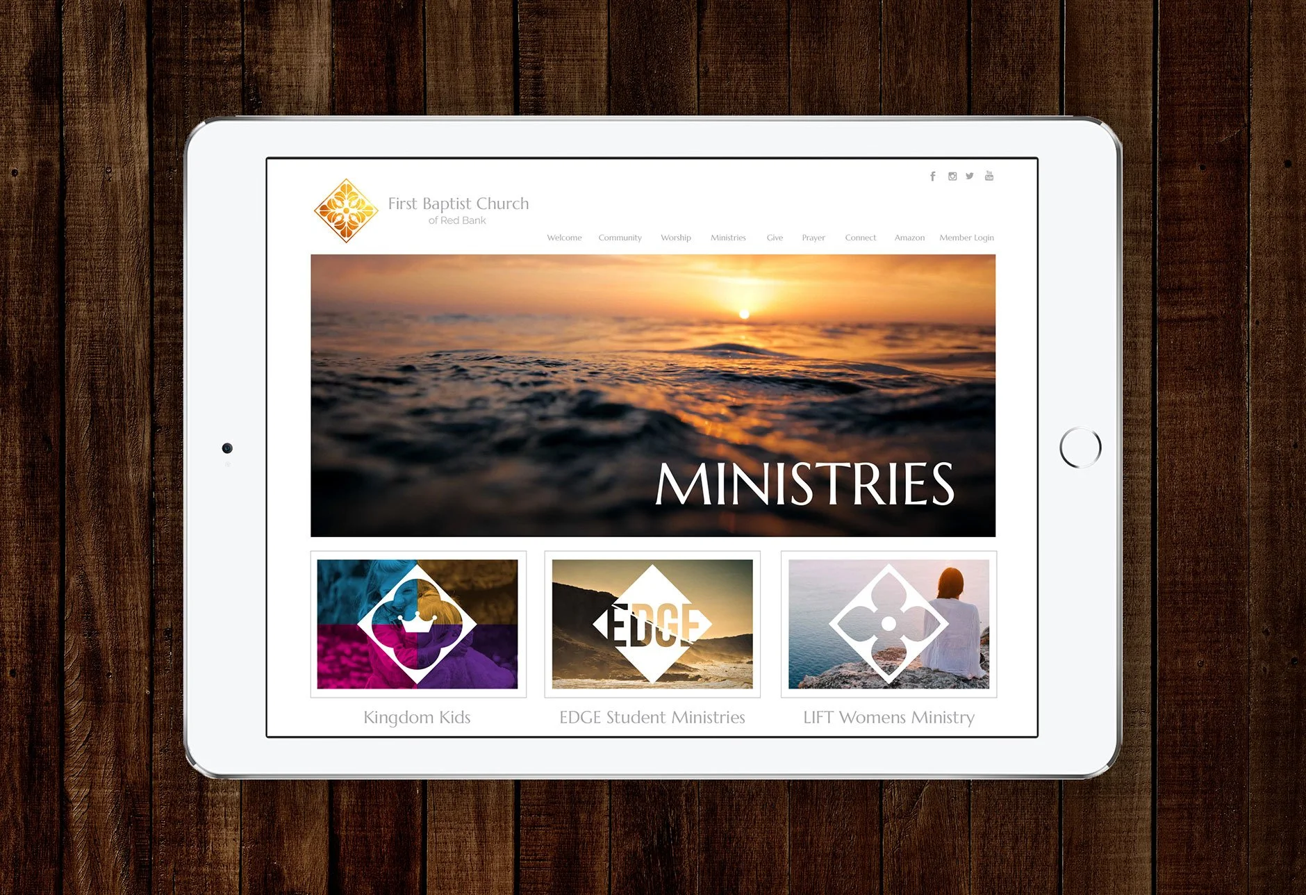
Like all churches, FBC was working towards appealing to a modern audience while also being true to who they are and what they believe. We wanted to create a clean and appealing look and feel while also trying not to look like they were "trying too hard." We also needed to create a branding system that could work with their existing and growing ministries, like their women's, children's, and youth ministry. I established typography sets for church-wide and ministry-specific uses to ease previous issues of consistency. For ministry logos, I returned again to the quatrefoils I found throughout the church. There were almost a dozen variations, which provided us with several options as they added new ongoing ministries. When it came to the youth ministry, I wanted to find a more youthful solution that still worked within the design system. There I harnessed the diamond shape that contained the quatrefoils.
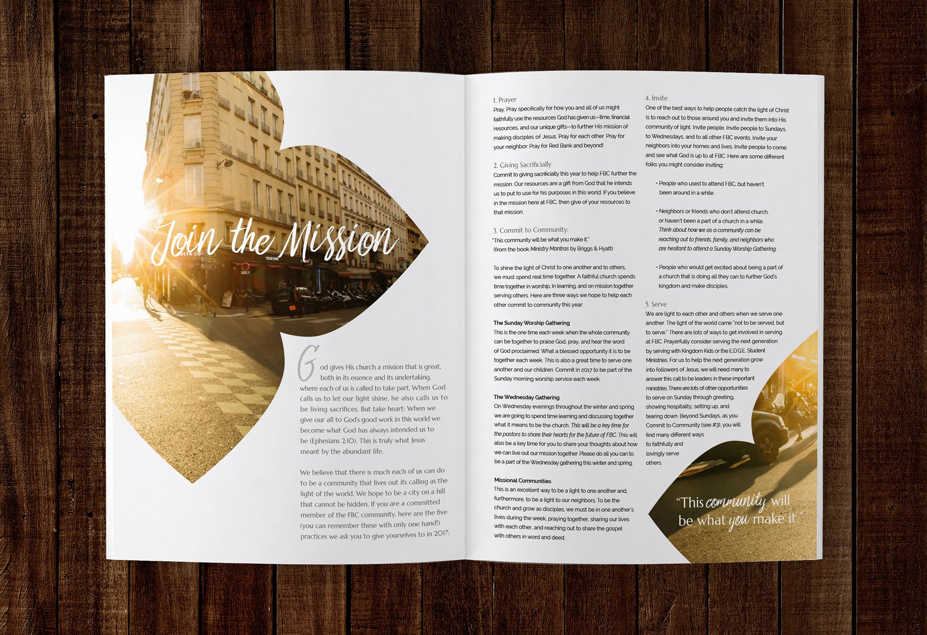
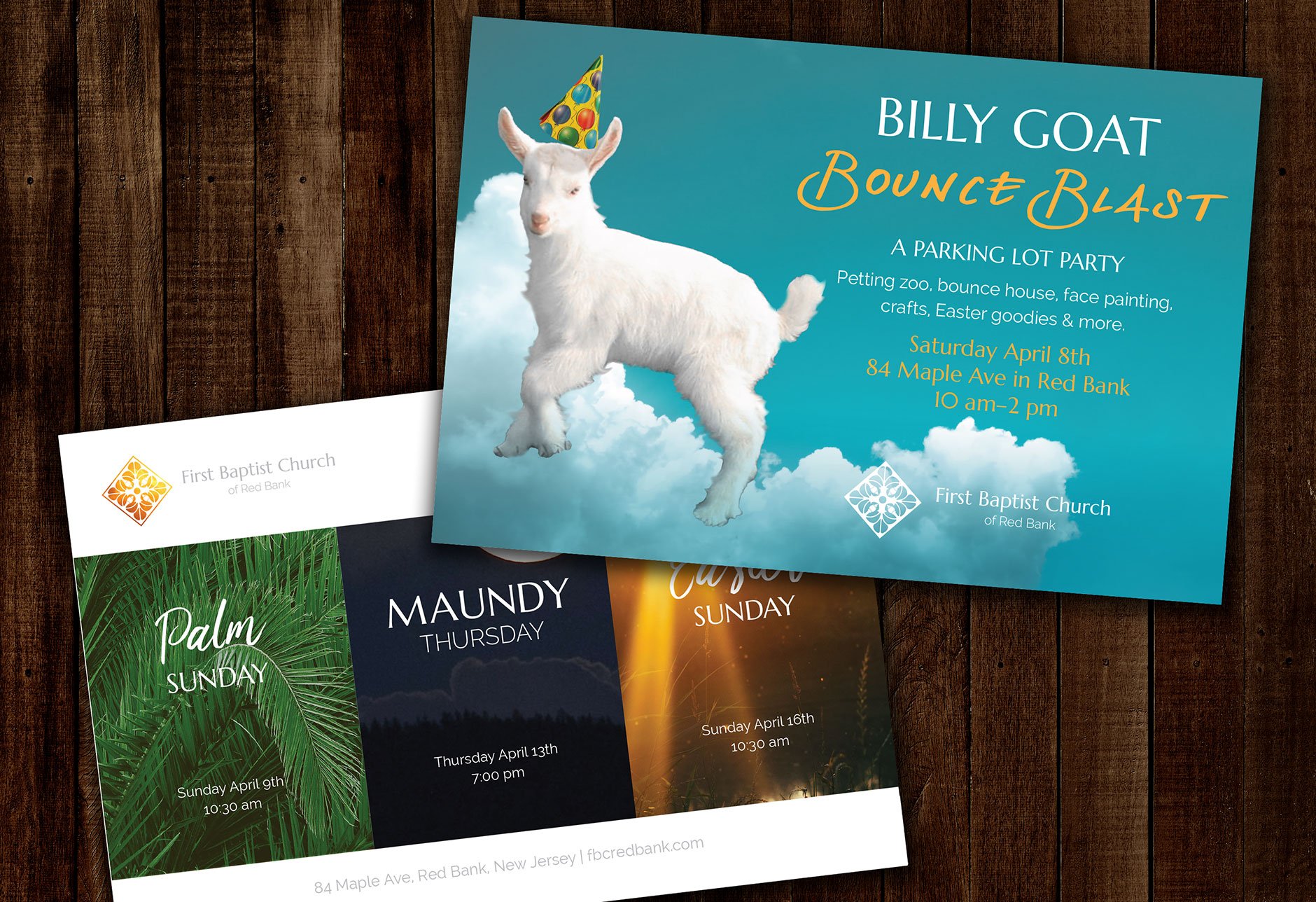
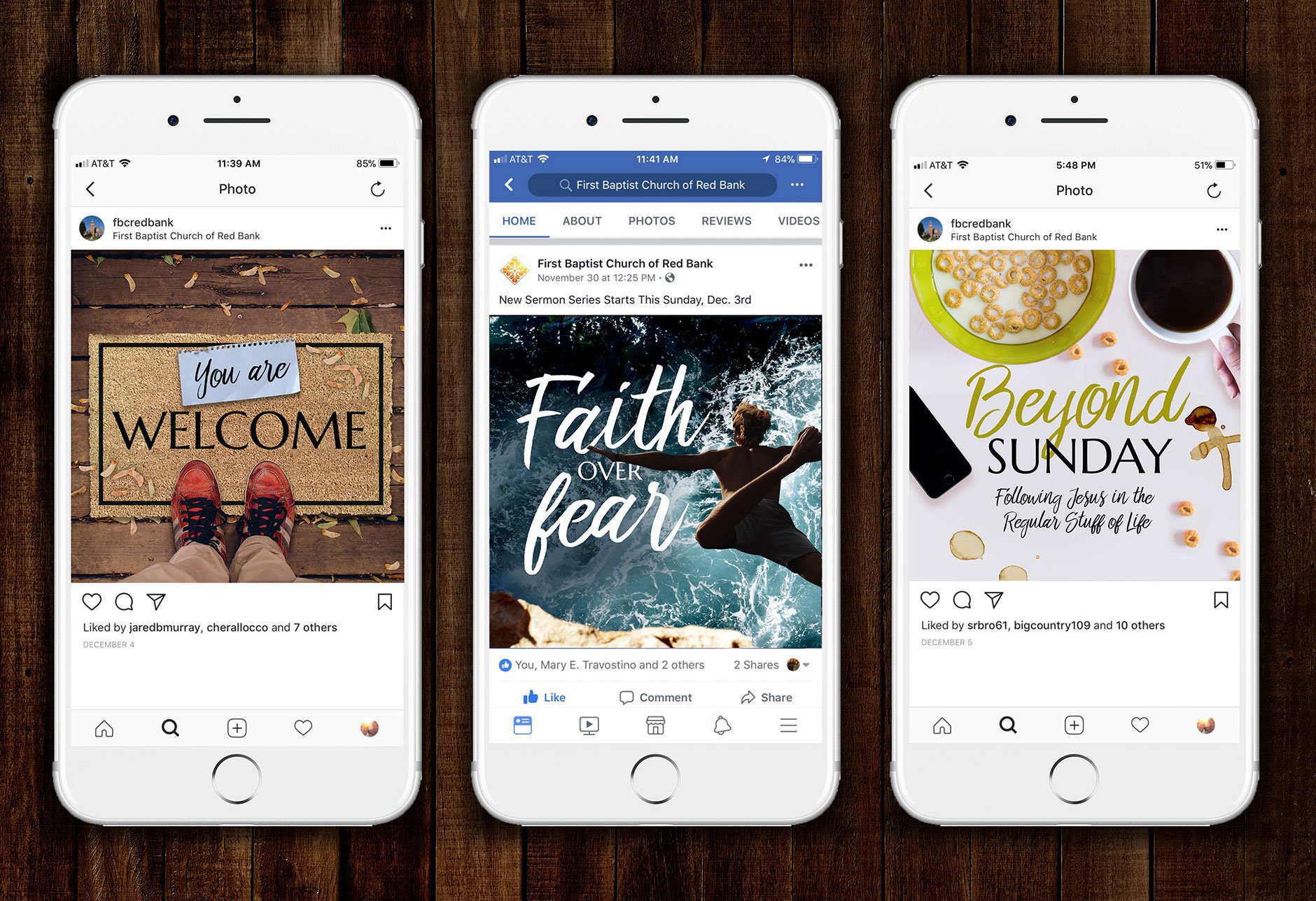
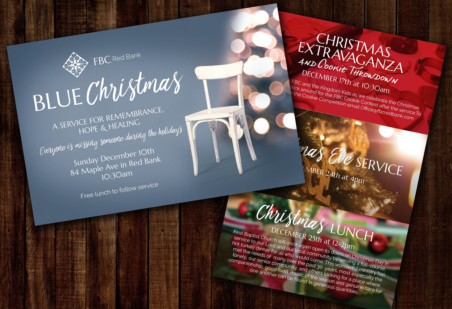
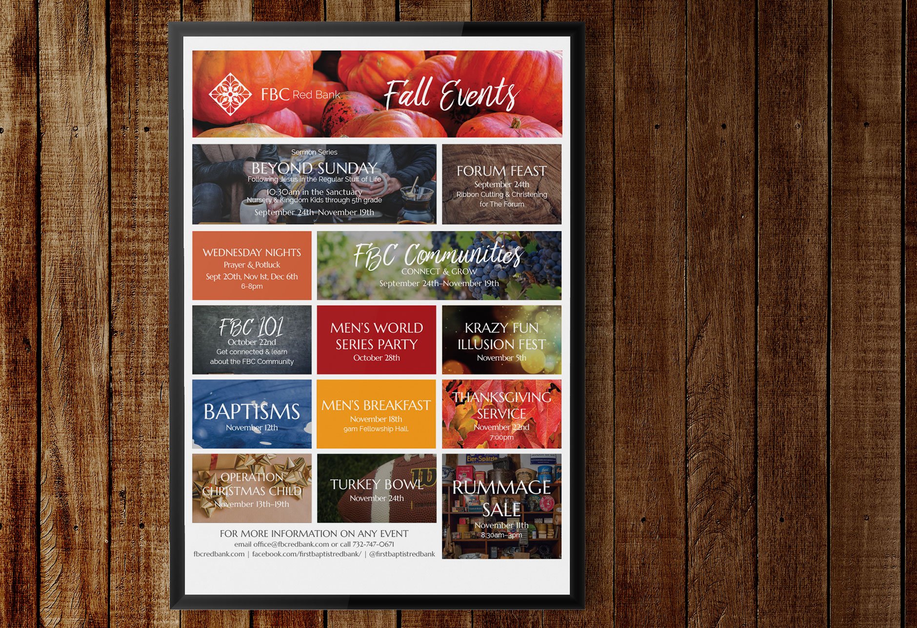
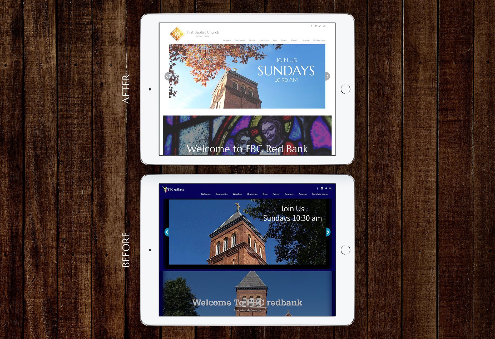
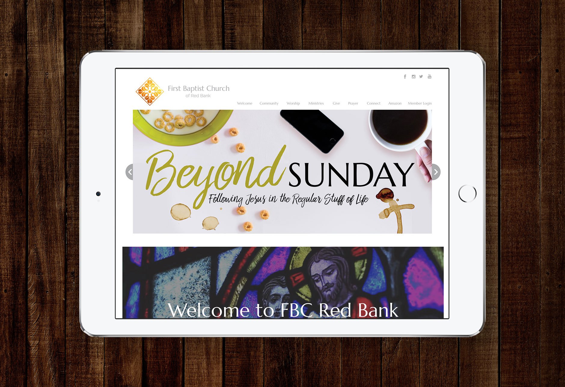
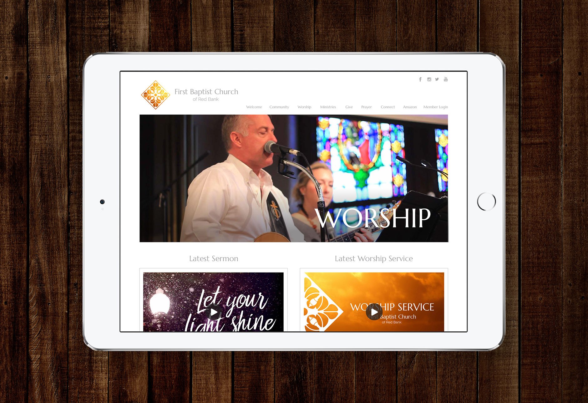
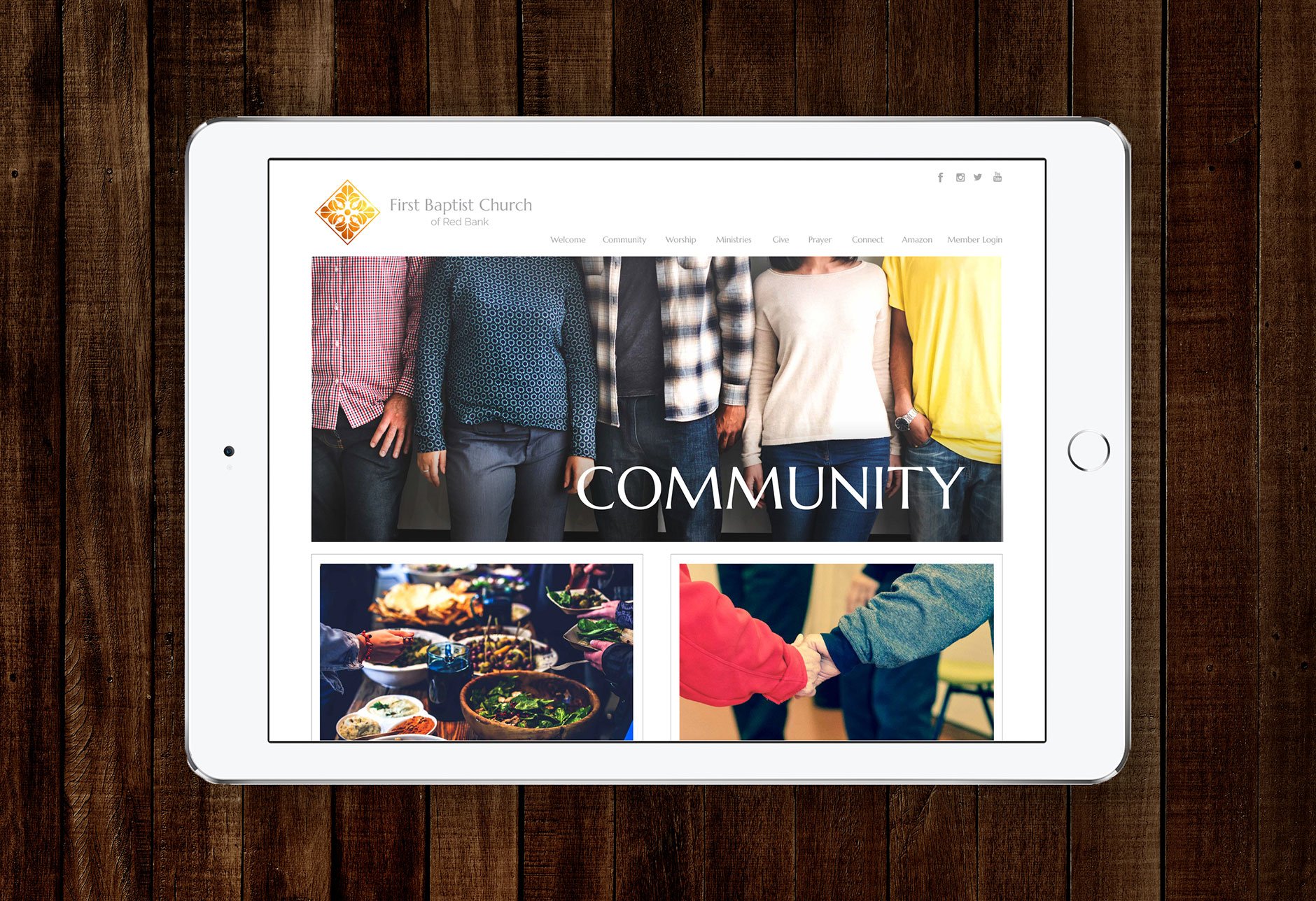
As with any non-profit organization, we needed to be mindful of being cost-and time-efficient. We decided to maintain their current website structure and simply give it a transformative facelift. To further the look and feel of being a light, we took their dark website and brightened it up with white backgrounds and light-based imagery. Then I was able to proceed with implementing our new look throughout all of their communications, from sermon series artwork, to event promotion, marketing materials, and social media. They’ve since merged with another congregation and operating under a new name.